The Moving Average Convergence Divergence (MACD) is a well-known technical indicator that was developed by Gerald Appel in the late 1970s. Even after several decades, it continues to be one of the most utilized tools by technical analysts worldwide, owing to its effectiveness in tracking price trends and identifying potential trading opportunities. The MACD is classified as a momentum oscillator, meaning it measures the speed and strength behind price movements. It is regarded as an oscillator because it fluctuates above and below zero , providing a visual representation of a trend’s direction and momentum.
The versatility of MACD makes it suitable for different types of traders, whether they are looking for short-term swing trades or long-term positions. It helps in recognizing changes in the strength, direction, and duration of a trend, which is invaluable in predicting future price movements.
Let's get started.
What is MACD?
The image above shows the daily chart of BHARTI AIRTEL. You would notice that in this chart two Exponential Moving Averages (EMAs) has been plotted: the 12-period EMA (faster moving average) ( shown in green) and the 50-period EMA (slower moving average)(shown in yellow).
As illustrated, when there is upward momentum, and the price of the stock rises, the distance between the two moving averages widens. This visual separation is known as "divergence," where the two EMAs drift apart from each other. Conversely, when momentum decreases and the price begins to fall, the moving averages move closer together, which is known as "convergence." You would able to appreciate this in the chart that has been shown above.
The same deportment of moving averages is observed during a downtrend, as depicted in the following image.
This image shows a daily chart of ASTRAL, which is currently in a downtrend. The same two moving averages (12-period and 50-period EMAs) has been plotted. you can appreciate that as downward momentum intensifies, the two moving averages start to diverge from one another and when the stock starts losing momentum and the price climbs slightly, the moving averages begin to converge.
This principle of divergence and convergence between moving averages forms the foundation of the MACD indicator. The MACD measures the difference between these two moving averages. The formula for calculating MACD is:
MACD = {Faster Moving Average} - {Slower Moving Average}
The "faster moving average" refers to a shorter period EMA (such as the 12-period EMA in the charts above), while the "slower moving average" refers to a longer period EMA (such as the 50-period EMA in the charts). so, in the examples above, the faster moving average is the 12-period EMA, and the slower moving average is the 50-period EMA. However, the default setting for MACD uses a 12-period EMA as the faster moving average and a 26-period EMA as the slower moving average.
The key concept is that during periods of strong momentum, the moving averages will diverge, and during periods of weakening momentum or potential reversal, they will converge. This is where the name "Moving Average Convergence Divergence" comes from. In a downtrend, the MACD is typically negative because the faster moving average (12 EMA) falls below the slower moving average (26 EMA).
Now that you have a better idea about the MACD indicator, let's go one step further and see how MACD is plotted in a chart and how to interpret a MACD chart
How is MACD Plotted on a Chart and How to Interpret it?
On a price chart, the MACD indicator is typically displayed below the price plot. It consists of two lines:
1. MACD Line: This line represents the difference between the two EMAs.
2. Signal Line: This line is an EMA of the MACD itself. The default setting for the signal line is a 9-period EMA of the MACD.
Both lines oscillate around a central 0 level. In addition, a histogram is plotted on the chart, consisting of red and green bars that represent the difference between the MACD line and the signal line:
{Histogram} = {MACD Line} - {Signal Line}
The histogram visually represents the trend and momentum behind the price movement. When the MACD line is above the signal line, the histogram is shown in green, indicating bullish trend. Conversely, when the MACD line is below the signal line, the histogram is usually red, indicating bearish trend. Additionally rising bars ( whether red or green) mean that the momentum is increasing. Red bars rising depict downward momentum and rising green bars mean bullish momentum. Conversely, falling bars in the histogram depict weakening momentum.
See the two lines and bars in the picture below.
In the chart above you can see MACD line in blue and signal line in yellow. The red and green bars shown in the chart is histogram that depicts difference between MACD line and signal line.
Now, let’s delve into how to interpret the MACD and its various signals.
MACD as a trend indicator: When the MACD is above the 0 level, it suggests that the stock is in an uptrend. If the MACD continues to rise, it is an indication that momentum on the upside is increasing. Conversely, if the MACD is below 0, it suggests that the stock is in a downtrend and the MACD line going further below 0 suggests an increase in downtrend momentum.
If the MACD moves away from the extremes (far above or below 0) and starts approaching the 0 line, it may indicate a potential price correction or a possible trend reversal on the horizon.
You can appreciate in the chart above that when MACD is above 0 stock is in uptrend and is in downtrend when MACD below 0 thus indiacating the trend in the stock.
MACD line crossing the signal line: A crossover of the MACD line above the signal line is considered a buy signal, while a crossover below the signal line is considered a sell signal. However, relying solely on these crossovers can lead to false signals and potential losses; hence, it is advisable to interpret these signals in the context of the prevailing trend and in concurrence with other indicators.
For swing traders, the most important buy and sell signals occur near the 0 line while for long-term traders, the most significant signals occur when the MACD is farther from 0. In both cases, it is essential to use the MACD in conjunction with other indicators to avoid false signals and enhance trading decisions. See the chart below.
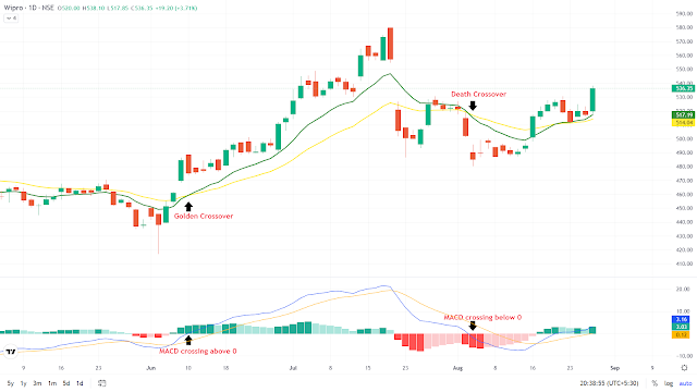
MACD crossing above or below 0: This event is also considered a buy or sell signal. When the MACD crosses above 0, it means the faster moving average has crossed above the slower moving average, representing a "Golden Crossover" (a bullish signal). Conversely, when the MACD crosses below 0, it signifies a "Death Crossover" (a bearish signal). A Golden Crossover typically indicates a potential upward trend, while a Death Crossover suggests a potential downward trend. This has been depicted in the chart below.
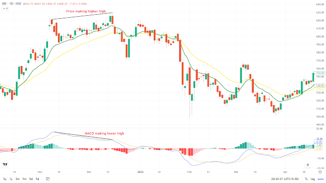
MACD divergence: Divergence occurs when the price movement of a stock and the MACD line move in opposite directions. For example, if the price is making new highs while the MACD is making lower highs, it may indicate a weakening trend and a potential reversal. Similarly, if the price is making new lows while the MACD is making higher lows, it could signal that the downtrend is losing momentum.
Chart showing price MACD divergence. Note that price makes a new high but MACD makes a lower high (shown by trendlines) suggestive of divergence. Also note that price falls after the divergence.
Conclusion
MACD is a robust indicator that provides valuable insights into price trends and momentum. It helps traders identify buy and sell signals, making it a valuable tool especially in trending markets. However, it should be used judiciously and in combination with other indicators to filter out false signals and improve trading accuracy.
Stay tuned for another post, where we will discuss various stock trading strategies using the MACD, helping you to leverage its full potential in different market conditions. You can also watch this Youtube video to understand the Basic concept of MACD, its interpretation and uses.
Further reading-
1) Use of moving average convergence divergence for predicting price movements- Dushyant Lal Joshi
2) An application of moving average convergence and divergence (MACD) indicator on selected stocks listed on National Stock Exchange (NSE) Abhishek Khatua


Post a Comment